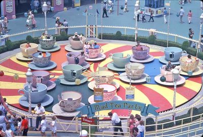
the visual candy of old Disneyland....
yum.....

here's the Fantasyland thrill ride, The Mad Tea Party or better known as the Teacups in 1964. plywood, fiberglass and paint...a Disneyland combination that rarely disappoints! sure its loud and cartoony, but at the same time, it's so tastefully done. the colors are so subtle. i mean, compare this to Toon Town..the colors there are generally loud and feel as if they were squeezed right out of the tube with little of the subtle blending of old Disneyland.

it seems the art directors at WED were using the same good taste and subtlety as the art directors of the animated films of that period. just compare the incredibly subtle color choices in films such as Alice In Wonderland, Peter
 Pan
Panand Lady and the Tramp. Disneyland had that same colorful, muted palette. I think that's the key...Disney would use great color combos but at the same time, mute them in such a way that they were soft and didn't scream over each other for attention. The fun color in the Teacups above I believe shows it.
now, go just over to Toontown today or "New" Tomorrowland or even the castle and you'll see what i mean. loud, overly saturated and kinda tasteless.
 honestly, take a look at Sleeping beauty's Castle over here! whoa! who pimped my ride? it looks like a Reno brothel...and i know 'em when when i see em!
i'd be very surprised if an art director came up with that without being coursed.
that said, i do think there are plenty of incredible things current Imagineering does well. it just seems that a uniform or singular vision is missing from the thought process. vintage Disneyland didn't happen on it's own. Walt gave his people the creative authority to make choices and it definitely showed...


2 Comments:
At least with Toontown you could argue that the over-the-top, saturated colors are there to make a guest feel as though he has walked into a crazy vintage cartoon (nevermind that vintage cartoons often had subtle, beautiful backgrounds).
The castle's bling has got to go, sometimes less is more for sure.
I loved the gleaming white Tomorrowland of the past. In theory the Jules Verne bronzes and patinas could have been interesting, but they needed to do more than just paint the existing buildings.
This is my first post. I just found this blog last night and it is great.
I have to dissent on the teacups, though. Clearly VERY carny influenced. I have to say the entire re-theming of te Fantasyland facades is a success IMHO.
And even though the Mad Tea Party clogs up the pathway in their current re-located state, they are logically near their Alice main attraction.
The current palette and theming are the most breathtakingly beautiful part of current Fantasyland.
I can't wait to keep reading your blog.
Post a Comment
<< Home